2023年05月28日
2023年10月01日
pixivっぽい(?)jQueryスライダー【改】
以前作った「pixivっぽい(?)jQueryスライダー」はパソコンから見ると概ねいい感じの動きなのですが、スマホから見ると二回タップしないとスクロールしなかったり、画像が真ん中に表示されないのが嫌だったので少し改造しました。
PHPとjQuery部分に変更はなく、HTMLとCSSを追加・調整しています。PCでの表示上の動きは新旧とも変わっていません。
動作デモ
機能
- [PHP] 指定したディレクトリ内のpngを取得してHTMLへ書き出す。
- [jQuery] ページを読み込んだ際に一番初めのimgへfirst activeクラスを、一番最後のimgへlastクラスを付与する。
- [jQuery] 画面の上下に配置したnext/prevがクリックされたら次/前のimgへactiveクラスを付与し、activeクラスのあるimgのトップへスクロールする。
- [jQuery] first/lastクラスとactiveクラスが同時に付与されている場合、next/prevを非表示にする。
コード
<body id="book">
<section ontouchstart="">
<?php
  $dir_name = dir("./");
  while ( $file_name = $dir_name -> read()) {
  $path = $dir_name -> path . "/" . $file_name;
    if (@getimagesize($path)) {
    echo '<div class="img"><img src="'.$file_name.'"></div>'."\n";
    }
  }
  $dir_name -> close();
?>
<p class="nav prev"></p>
<p class="nav next"></p>
</section>
</body>
HTMLの変更点
PHPの記述を挟むように<section ontouchstart=””>(2行目)</section>(15行目)を追加。
ontouchstart属性が付与されることで、マウスオーバーの挙動が改善され、二回タップしなくてもnext/prevが反応するようになりました。
#book {
  margin: 0;
  padding: 0;
}
#book section {
  margin: 0 ;
  padding: 0;
}
#book div.img {
  scroll-snap-align: center;
  height: 100vh;
  display: flex;
  flex-direction: column;
  justify-content: center;
  align-items: center;
}
#book img {
  display: block;
  width: auto;
  height: 100vh;
}
.prev {
  margin: 0;
  padding: 0;
  position: fixed;
  width: 100vw;
  height: 40vh;
  top: 0;
  opacity: 0;
  background: url(img/nav_prev.png) no-repeat top center;
  z-index: 1;
}
.prev:hover {
  opacity: 1;
}
.next {
  margin: 0;
  padding: 0;
  position: fixed;
  width: 100vw;
  height: 40vh;
  bottom: 0;
  opacity: 0;
  background: url(img/nav_next.png) no-repeat bottom center;
  z-index: 1;
}
.next:hover {
  opacity: 1;
}
@media only screen and (max-width: 480px) {
  #book div.img {
    scroll-snap-align: center;
    height: 100svh;
  }
  #book img {
    display: block;
    width: 100vmin;
    height: auto;
  }
  .prev {
    height: 50vh;
    background: none;
  }
   .next {
    height: 50vh;
    background: none;
  }
}
CSSの変更点
HTMLで追加された#book section(5行目)のmarginとpaddingを0に。
#book div.img(9行目)の表示方法をdisplay: block;からdisplay: flex;(13行目)へ変更。
flex-direction: column;(14行目)で縦並び、justify-content: center;(15行目)で水平方向のセンタリング、align-items: center;(15行目)で子要素をセンタリングします。
画像1ページ分の領域を画面サイズ(ビューポート)全体にして、子要素の#book imgは親要素のalign-items: center;で中心に表示されます。
@media only screen and (max-width: 480px)(50行目)のheightの単位をvhではなくsvhにすることでスマホのアドレスバー等の高さも考慮されて画像がセンタリングされます。
$(function () {
$("div:first").addClass("first active");
$("div:last").addClass("last");
function toggleChangeBtn() {
var indexF = $(".first").index();
var indexA = $(".active").index();
var indexL = $(".last").index();
$(".nav").show();
if(indexF == indexA) {
$(".prev").hide();
} else if(indexL == indexA) {
$(".next").hide();
}
toggleChangeBtn();
$(".next").click(function() {
var targetY = $(".active").next().offset().top;
var $target = $(".active");
$target.removeClass("active");
$target.next("div").toggleClass("active");
$("html,body").animate({scrollTop:targetY});
toggleChangeBtn();
});
$(".prev").click(function() {
var targetY = $(".active").prev().offset().top;
var $target = $(".active");
$target.removeClass("active");
$target.prev("div").toggleClass("active");
$("html,body").animate({scrollTop:targetY});
toggleChangeBtn();
});
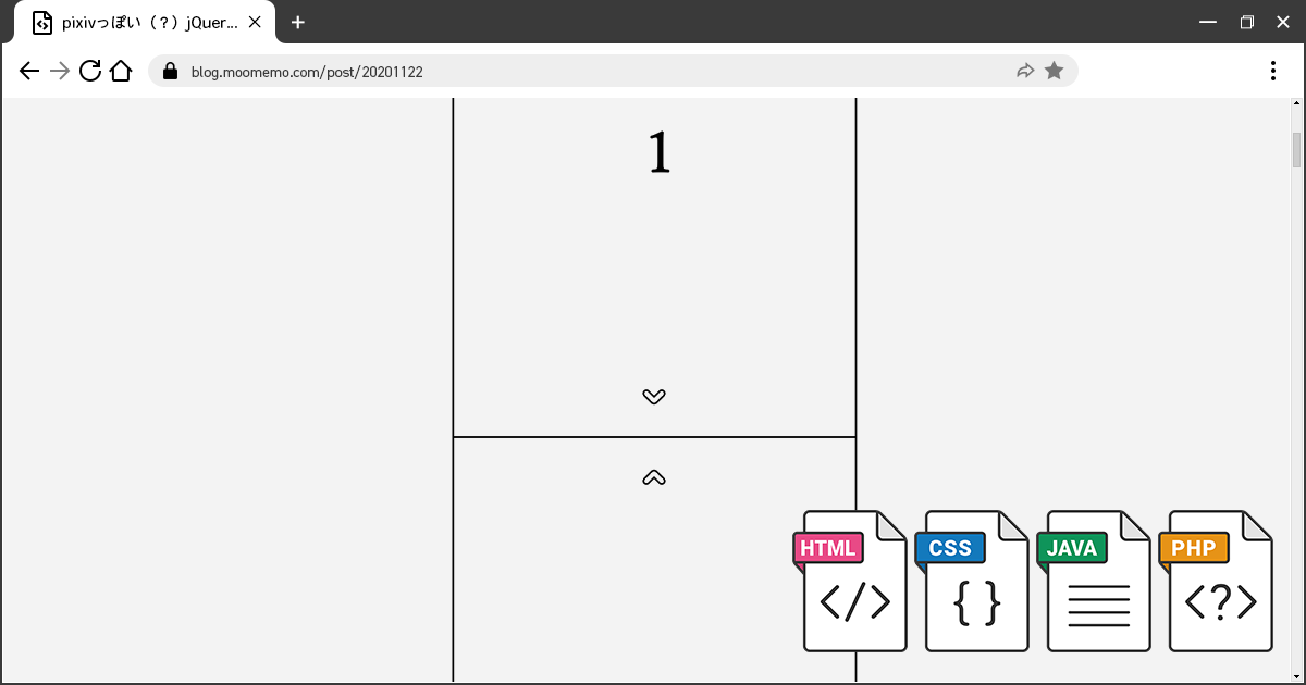
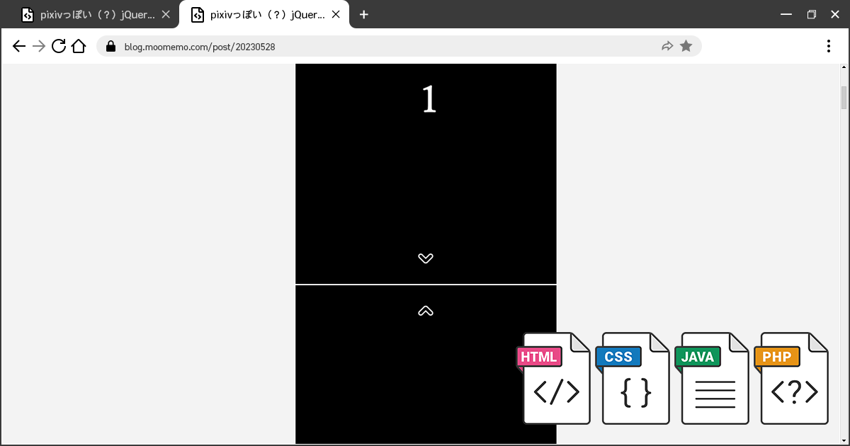
});動作イメージ
旧スライダー
新スライダー
参考
- ディレクトリ内にある画像を一覧表示 | webデザイン受講生の日々の勉強の様子
- 超簡単!jQueryでスライダーを自作 | Qiita
- jQuery:スクロールするレイヤー内で指定位置までスクロールさせる | ハックノート
- スマホでのhoverを考える。 | フーノページ
- もう迷わない!CSS Flexboxの使い方を徹底解説 | Web Design Trends
- CSSの新しい単位「lvh」「svh」これでiOSのSafariで100vhがビューポートの高さではない仕様に対応できる | コリス
おすすめ書籍
リンク
リンク